Situation
When I moved into my new house, I was faced with a daunting challenge: selecting an energy plan. With over 60 different options available from various providers, I felt completely overwhelmed. I didn’t want to lock myself into a long-term contract that could turn out to be a bad deal, especially considering the hefty early termination fees. The stakes were high, and the decision felt paralyzing.
I kept asking myself, “How do I figure out which energy plan is the best for my home’s specific needs without making a costly mistake?”
Task
My task was simple but significant: choose the best energy plan that would save my household the most money in the long run. But without having lived in the home before, I had no idea how much energy we would use. I needed a method to accurately predict my home’s energy consumption and compare all 60 energy plans to determine which one would give me the best rate.
Action
Instead of just guessing or picking the plan with the lowest advertised price, I took a data-driven approach. Here’s how I tackled it:
- Data Collection: I began by gathering historical weather data for my area using Python for dynamic web scraping. Weather plays a huge role in energy consumption, so I knew this would help predict my usage based on heating and cooling needs.
- Energy Usage Prediction: I used pandas to manipulate the data and combine it with my home’s expected energy usage, using scikit-learn to build and tune a regression model. This model predicted my energy consumption based on variables like outside temperature, historical usage trends, and seasonal patterns.
- Database Storage & Aggregation: I stored all of this data in a PostgreSQL database, allowing me to efficiently manage and query it as needed. This was crucial in handling large amounts of weather and energy plan data, and in calculating projected yearly costs for each energy plan based on my predicted usage.
- Visualization & Decision-Making: I used Power BI to build an interactive dashboard, which allowed me to visualize how much I would pay under each plan based on my predicted energy usage. This made comparing the 60 different energy plans manageable and easy to digest.
Through these steps, I was able to evaluate the total cost for each plan, factoring in hidden fees, usage tiers, and seasonal variations in energy consumption.
Result
In the end, I didn’t just pick the cheapest plan—I picked the one that aligned with my actual energy needs. This decision led to a 34% reduction in my yearly energy bill, saving my household nearly $1,000.
The Data Solution Breakdown
This project was an end-to-end data engineering to machine learning reverse ETL decision-making process (yes. All the buzz words). If you’re a business professional interested in learning how to architect and build data solutions, this project mirrors my work as an operational data analyst in a large healthcare practice.
I’ll break down each component of the data solution lifecycle, showing how businesses can leverage data-driven decisions to improve operational efficiency and scalability. We’ll cover:
- Data Engineering: Collecting and preparing large datasets for analysis
- Data Analytics: Analyzing and interpreting that data to find insights
- Business Intelligence: Visualizing data for stakeholders to support decision-making
- Machine Learning: Predicting outcomes to guide strategy
- Data Architecture: Building robust storage solutions that support data pipelines and access
This blog post serves as a real-world example of how these roles come together to form a cohesive, modular data solution. As companies increasingly invest in data, the need for specialized roles will grow—ensuring that data solutions aren’t reliant on a single “tech unicorn.” By creating a modular data team, businesses can scale efficiently while improving their overall return on investment (ROI).
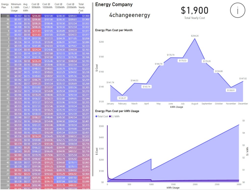
But first, let’s dive into the resulting dashboard that allowed me to make my data-driven decision. This will help illustrate the importance of delivering a dashboard that not only visualizes data but prompts a clear call to action(click to see the report) for stakeholders. Every dashboard should empower decision-makers with actionable insights.
When making the dashboard, it’s important to know the target audience and mode of presentation. Consider these factors:
- Target Audience: How in-depth does the audience need the details to be?
- Data Visualization: What type of visualizations are they most familiar with? Is the information easily digestible for them?
- Filters and Slicers: What filters or slicers will they need or ask for?
- Key Data Points: Which data points should be highlighted to draw their attention?
- Actions: What actions are within their power to take based on the data?
- Assumptions: What underlying assumptions in the data should be explicitly declared to avoid misinterpretation?
- Acronyms and Domain Terms: Are there acronyms or domain-specific terms that need to be used for continuity across business reports?
- Viewing Platform: Will the dashboard be viewed on a mobile device, tablet, or desktop? The layout and design should be optimized for the intended platform.
- Viewing Frequency: How often will the audience access the dashboard? If it’s a daily, weekly, or monthly report, ensure it’s easy to locate and navigate.
- Automation: If the dashboard is part of a recurring report, should an automated PDF version be generated and sent to stakeholders on a regular schedule?
- Shareability: Will the stakeholders need to share the report with others, either inside or outside the organization? Ensure that permissions and access controls are in place for easy yet secure sharing.
- Cloud Access: Is the dashboard hosted on a cloud platform that allows users from multiple tenants to access it? Consider how accessible it is based on the organization’s tech stack (e.g., Power BI Service, Tableau Cloud, etc.).
- Report Format: Should the report be easily downloadable in different formats (PDF, Excel, etc.) to accommodate the needs of the stakeholders who prefer printed or digital formats?
All of these bullet points are insights I’ve picked up during my time creating and sharing reports in my current data role at a healthcare practice. You can imagine how drastically reports can differ when they’re meant for management, operations, healthcare providers, or individual contributors. I’ve built many reports using various tools: from automated emails, dashboards, and Excel VBA-assisted tools to paginated reports, PDF booklet printouts, and more. Addressing all of the criteria listed above before publishing will ensure you don’t unknowingly create tech debt that can lead to a backlog of report revisions for your data team.
Please feel free to navigate through the report and its pages. The first page is where the call to action is, allowing you to compare and choose the most cost-effective energy plan for my household. While perusing the report, check the helper icons for additional details and insights.
With that, this overview blog post of the project comes to its conclusion. We’ve covered a lot, but there’s still much more to dive into. Over the next few weeks, I’ll be posting more to uncover the intricacies of this project and how it fits into a data team. Stay tuned for those announcements!
Thanks for reading!

Leave a comment